
By Tuyen Lam
In the world of visual design, what you don’t see is just as important as what you do. Two foundational yet often overlooked concepts—White Space and Negative Space—play a critical role in how we perceive and engage with design.
Though these terms are sometimes used interchangeably, they serve different purposes. Let’s explore how they each contribute to clarity, elegance, and meaning in visual communication.

White Space: Breathing Room for Better Design
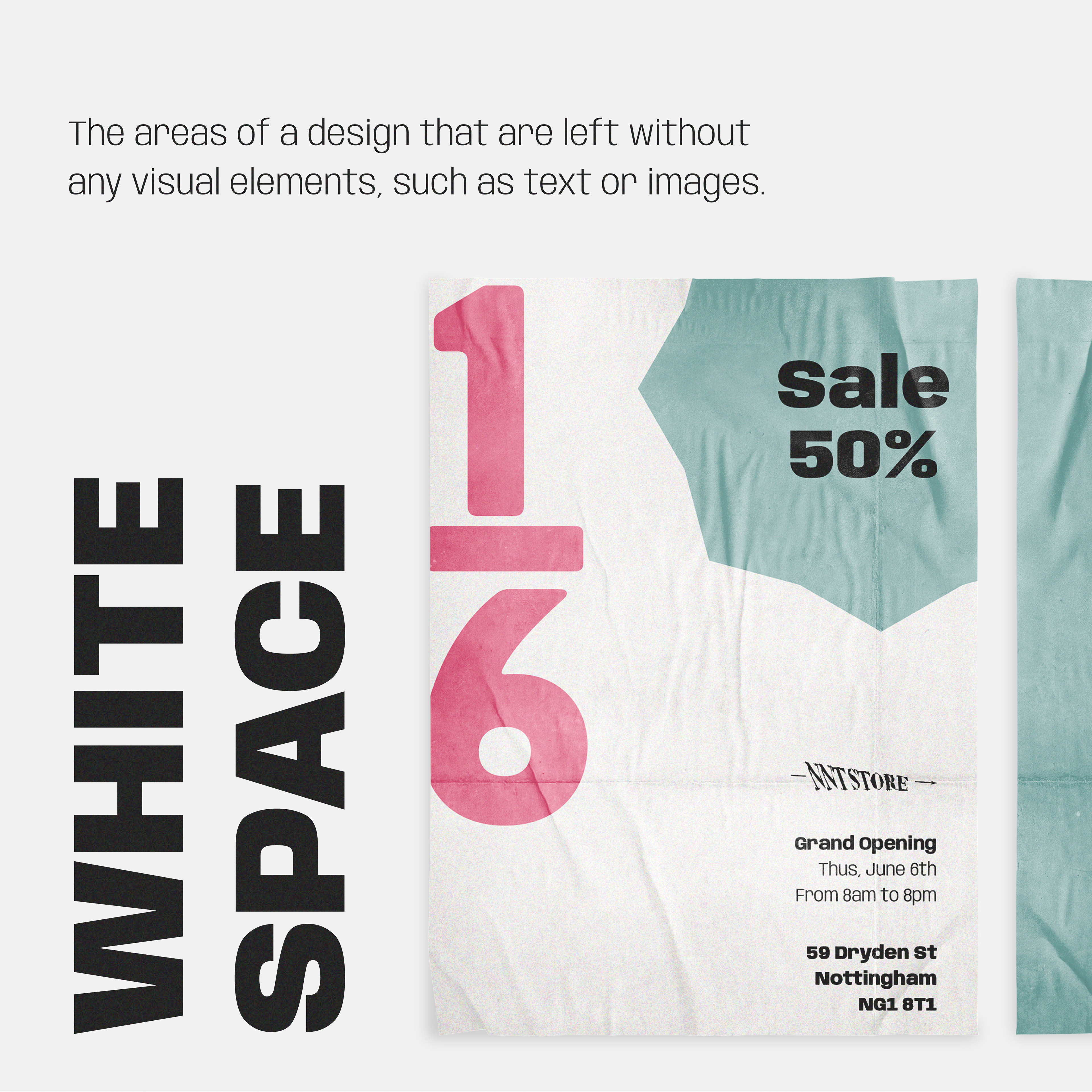
White space—also known as blank space or resting space—refers to the unmarked areas of a design. This isn’t “empty” space or wasted potential; it’s an intentional choice that adds balance, elegance, and readability.
Well-used white space allows designs to feel open, airy, and professional. It enhances user experience by giving the eyes a place to rest, guiding attention to key elements without overwhelming the viewer.
Why It Matters
Unfortunately, many printed materials, especially those from quick-turnaround print shops—like business cards or roadside flyers—tend to crowd every inch with text and images. The result? Cramped, cluttered layouts that are visually exhausting. People often glance once, feel overwhelmed, and discard them without absorbing the message.
White space is what separates professional design from visual chaos. It communicates confidence. It tells the viewer: We know what matters—here it is.
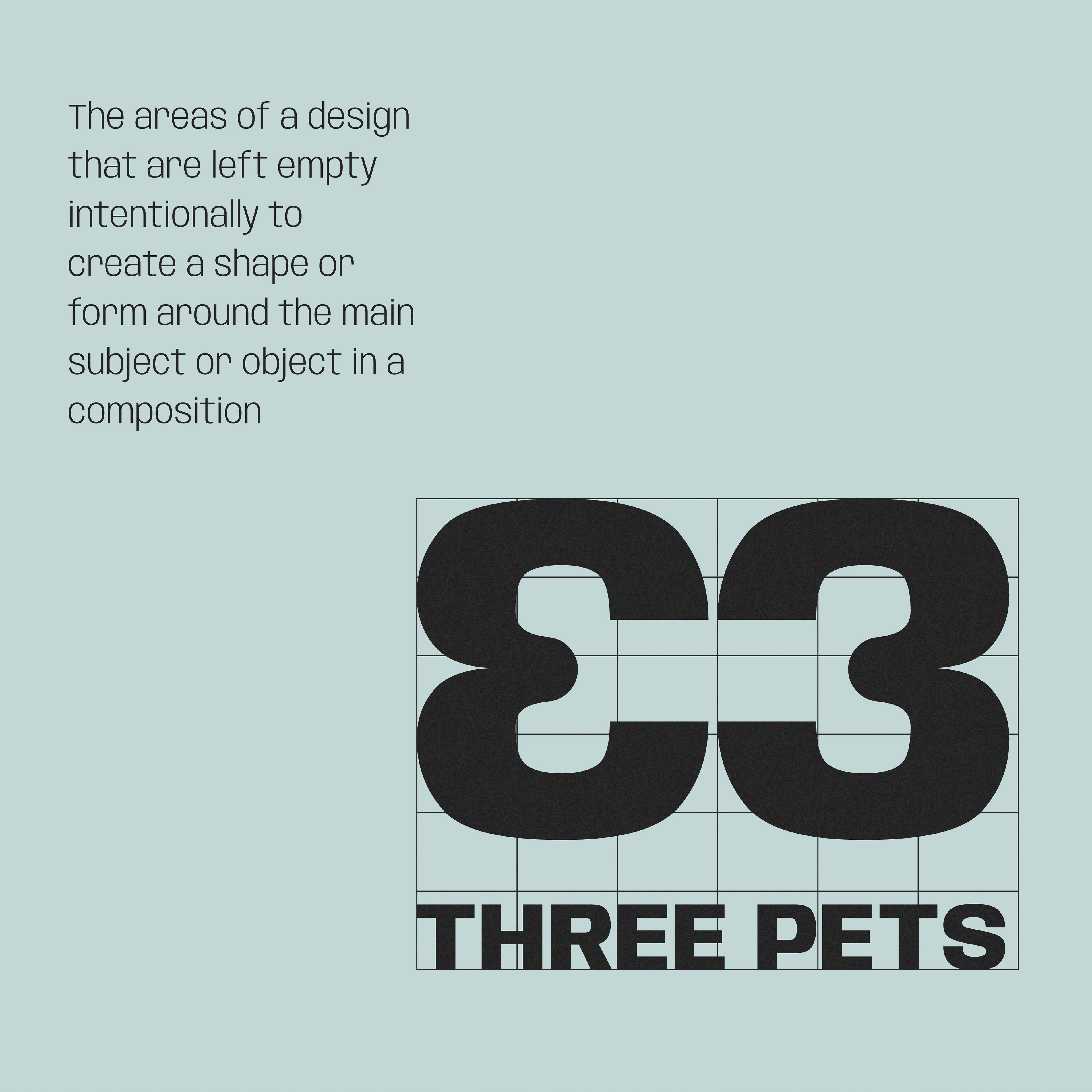
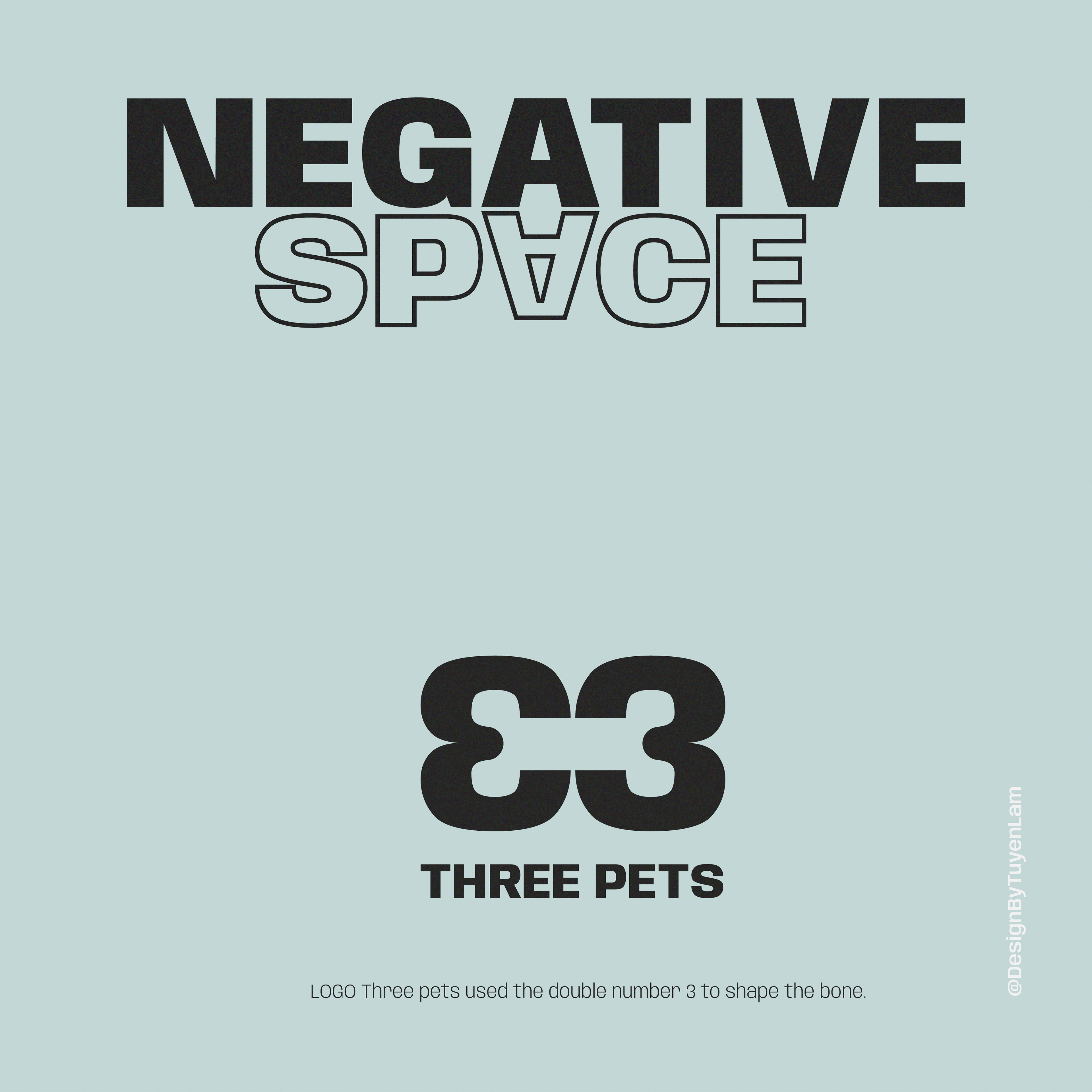
Negative Space: Meaning in the Unseen
While white space focuses on layout and balance, negative space goes a step further: it turns the “empty” areas around and within elements into visual storytelling tools.
Negative space is often used creatively in logo design, posters, and illustrations to reveal hidden images or messages. One of the most iconic examples is the FedEx logo, where the white space between the “E” and the “x” forms a subtle arrow—symbolizing speed, direction, and forward movement.
Why It Works
Negative space taps into the viewer’s subconscious. It rewards careful observation and leaves a lasting impression. When used skillfully, it can:
Reinforce brand values or messages
Create visual surprises that delight the viewer
Add layers of meaning without adding clutter
In minimalist designs, negative space becomes the canvas that supports and defines the subject—making it more impactful.
Final Thoughts
White space and negative space are quiet forces in design—often unnoticed, but always felt. They don’t shout, but they guide, shape, and refine. When used skillfully, they transform design from something seen into something experienced.
So the next time you lay out a flyer or sketch a logo, remember: design isn’t just about what you add—it’s also about what you choose to leave out.