Project idea
The inspiration for my project comes from my personal experiences and their profound impact on me. Growing up in the peaceful countryside, I was attracted by the beautiful sight of the starry night sky. However, as revisited this experience growing up, I was upset by the effect of light pollution.
Motivated by curiosity, I started deeply research, discovering that many people around me were oblivious to the detrimental effects of light pollution. Driven by a sense of responsibility, I chose "Light Pollution" as the central theme for my project, aiming to raise awareness and ignite change. Through artistic techniques and mediums, I aim to engage and compel the audience to contemplate their choices and take action. My project is a call to preserve the night sky and foster collective responsibility for our environment.
Project name
SWITCH OFF
In my pursuit of creating an exhibition that raises awareness about light pollution, one crucial step was to choose a memorable and strong name. I brainstormed a variety of options by myself, considering names such as "Bring the Dark Back," "Bring Back the Night," "Light Out, Nature On," "The Dark Side of Light," and "Light Up Your Mind, Fight Light Pollution." However, as I pondered further, I realized the significance of a name that should begin with a verb, as it possesses a stronger impact and has the potential to call action when encountered by the audience.
Colour choice
For added visual impact and contrast with the black background, I chose a neon colour named Halerqueen Green (by https://www.color-name.com/). This neon colour serves multiple purposes within my design. Firstly, its boldness catches the viewer's attention and stands out against the black backdrop. Secondly, as a non-existent colour in nature, it represents artificial light. I utilized this colour for the logo and title to highlight their significance and draw attention to the concept of artificial light pollution.
Invitation design
Physical version
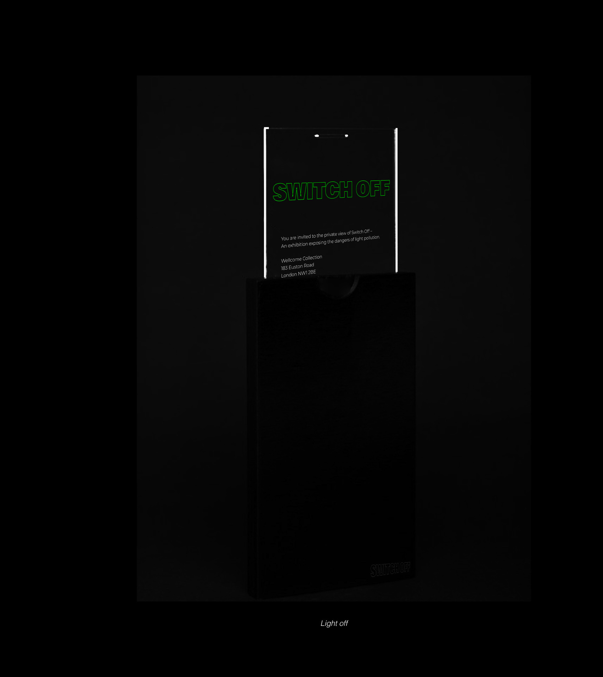
For the design of my physical invitations. I decided to use glow-in-the-dark material into the design, allowing recipients to experience a glow effect. When individuals receive these invitations and place them at home or on their desks, something magical happens. Even in the absence of light, the glow-in-the-dark material illuminates, showing the essential information on the invitation. This creative approach ensures recipients can easily access the details, even when the surrounding environment is dim or dark.

Digital version
Encouraging dark mode usage on everyday devices became the foundation for my online invitation design. When recipients open the email, they are prompted to activate dark mode to read the invitation due to white text on a white background. This idea stemmed from my research on light pollution and its connection to the blue light emitted by our devices. Excessive exposure to this light can negatively impact health, causing sleep issues and distractions. My invitation design (used png file with all information in white colour) serves as a visual reminder to activate dark mode, protecting users' eyes from excessive light.
Hand-out design
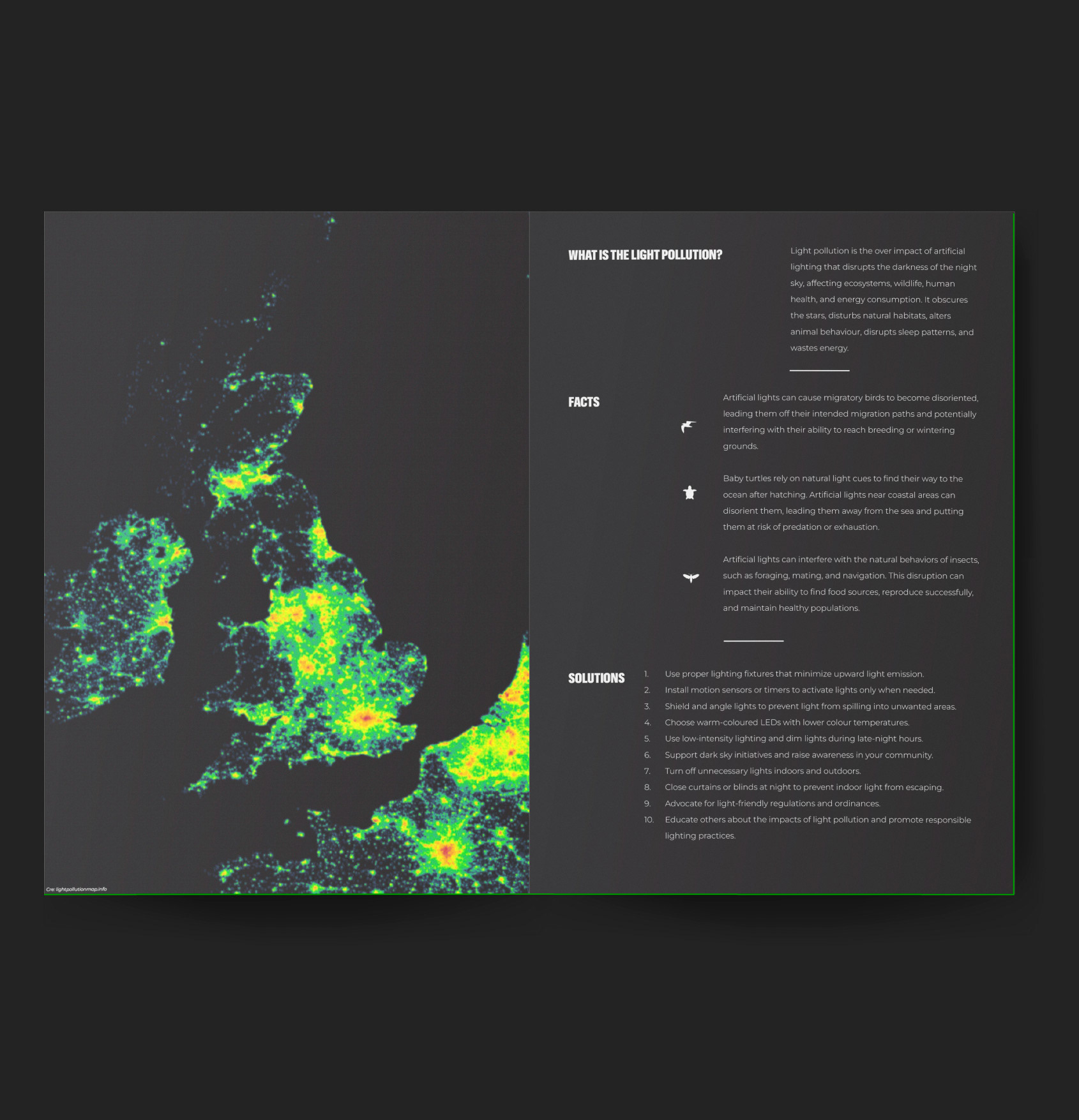
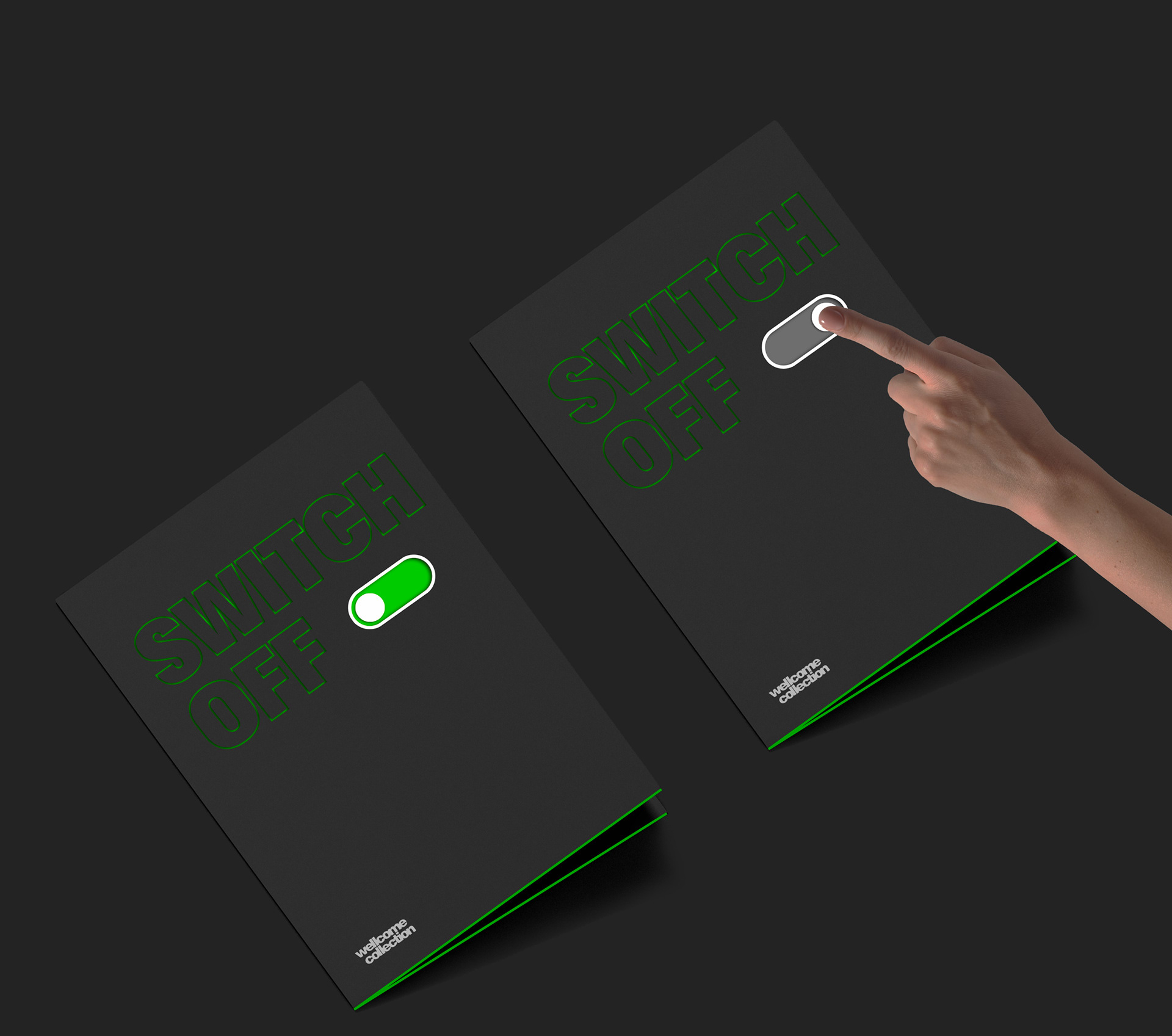
By providing handouts at my exhibition, I aim to educate visitors about light pollution by sharing facts, statistics, and potential solutions. The purpose is to equip them with knowledge and information, enabling them to understand the issue and discover ways to mitigate light pollution.
Material:
Black paper, 220gsm
Glow in the dark paper
Technique:
Printing in the black paper
Colour printing
Lazer cut (1st page)
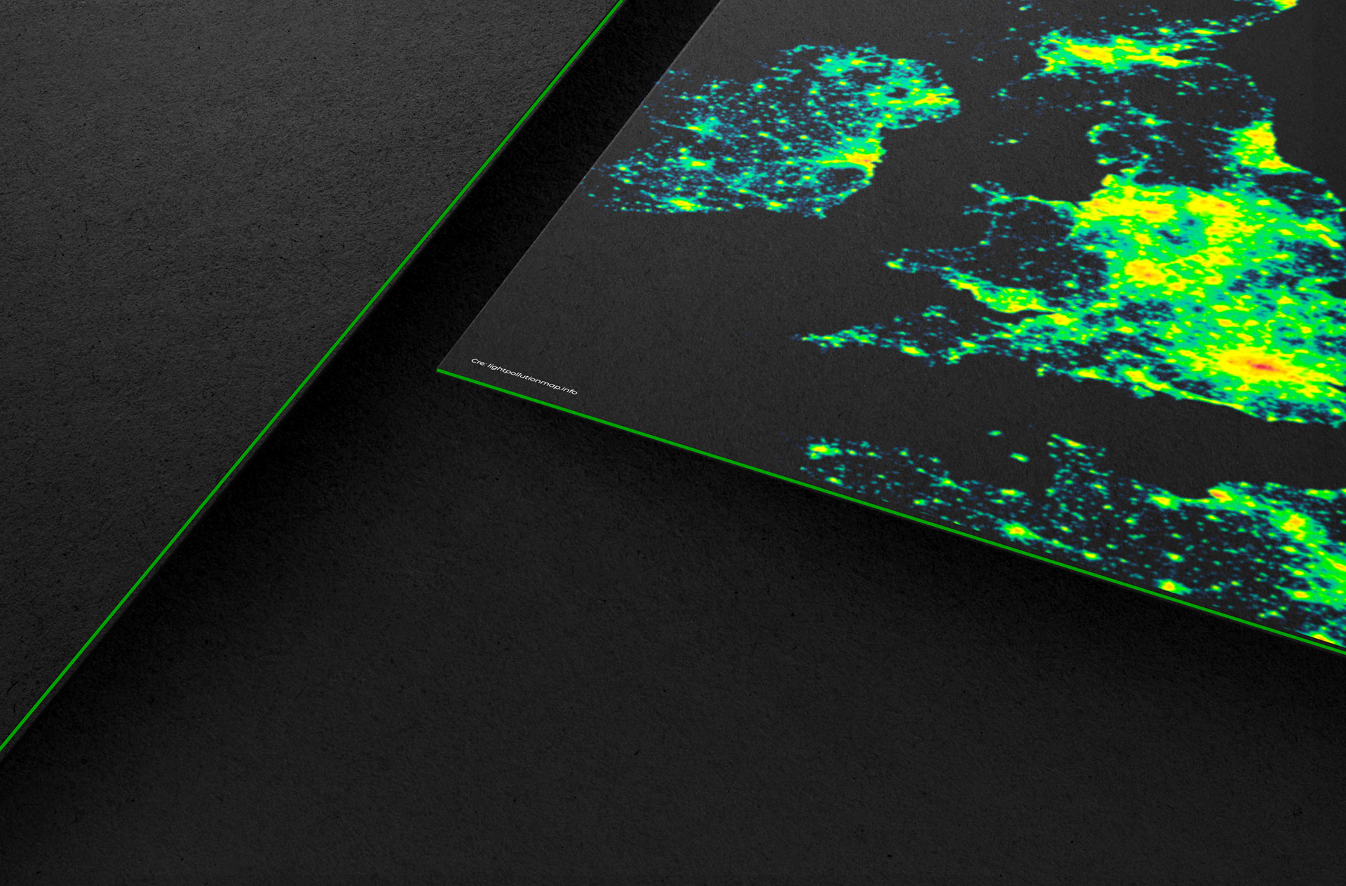
3 layers paper: Black - Glow in the dark - Black
Poster design
When designing posters to promote the Switch Off Exhibition and the Switch Off website, I aimed to convey a strong message to the audience. I opted to focus on highlighting the factual information and negative effects of light on baby turtles, migratory birds, and insects. To capture the attention of passersby, I transformed these concepts into captivating videos.
Street light effect
Given that the tagline for my exhibition is "Shining the light on light pollution", I used street lights to directly convey the facts and messages to the audience. As depicted in the picture, I strategically used light to highlight the relevant information on the streets, making it more accessible and noticeable to pedestrians.
Interactive web design
There are three compelling reasons for designing this landing page.
Firstly, it serves as a valuable alternative for individuals who are unable to physically attend the Switch Off exhibition due to distance or other limitations. By visiting the Switch Off website, they can gain access to the same knowledge and information presented in the exhibition.
Secondly, in the event that a physical exhibition is not feasible, the website becomes a powerful tool for promoting and raising awareness about light pollution. This aligns with the primary objective of the project, which is to increase public awareness.
Lastly, for those fortunate enough to visit the Switch Off exhibition in person, the website offers an additional digital experience and serves as a resource for further exploration and learning on the topic.
Exhibition
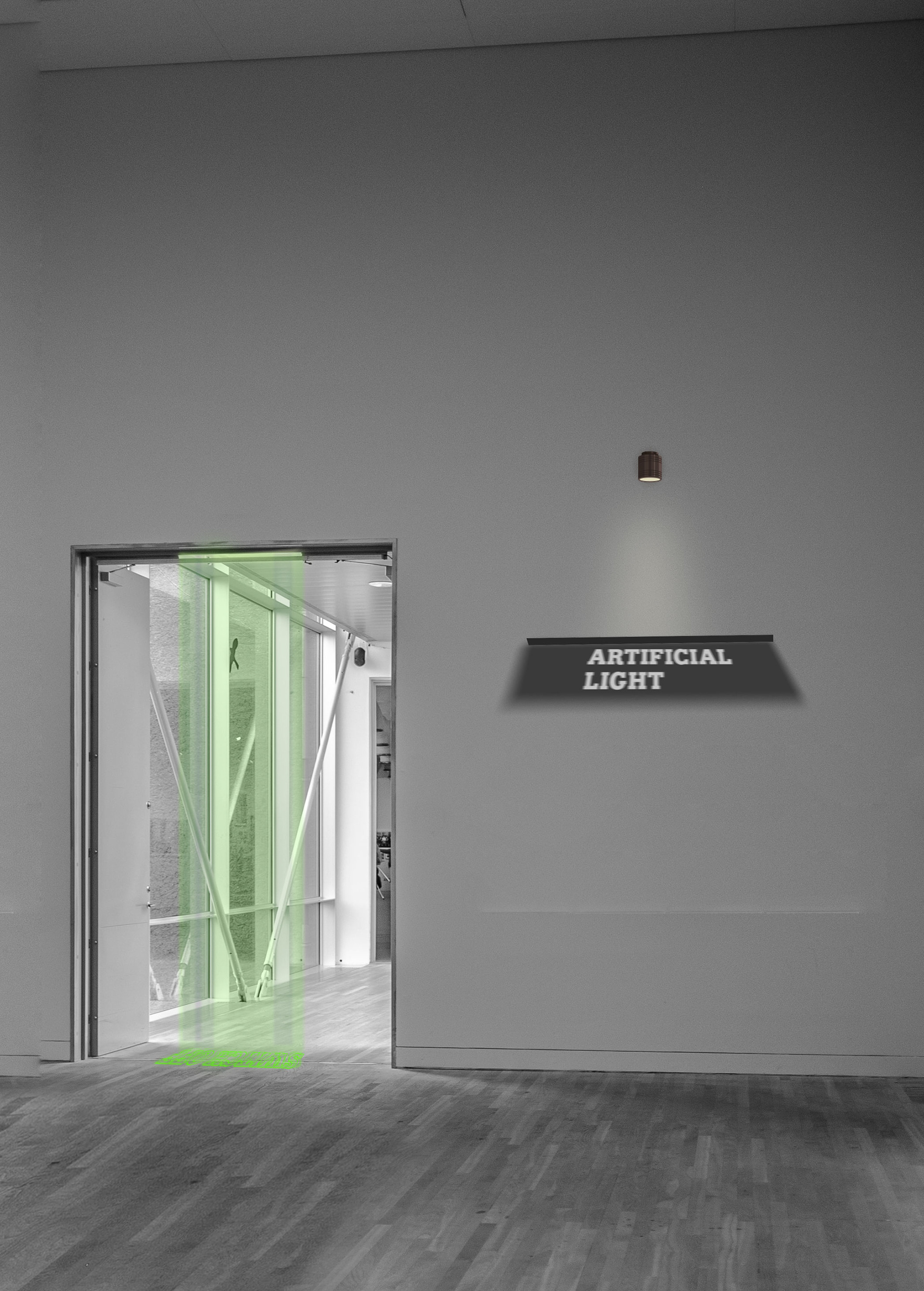
The exhibition consists of three distinct rooms. Upon entering, you are greeted by the Switch Off logo illuminated on the floor using a green laser. Moving forward, you encounter the largest room, which is enveloped in darkness. Here, projectors display facts about light pollution on the floor, while the walls showcase images of birds and turtles affected by this issue, accompanied by informative descriptions. In the following room, you witness the illusion of insects flying around a light bulb. Visitors are encouraged to sit on chairs and capture photos, although the insects are not real. Another projector enhances the visual effect by projecting images on the wall. Finally, you reach the last room, which offers a serene atmosphere with a simulated dark and beautiful sky. Visitors can choose to sit or lie on the floor, allowing them to relax and immerse themselves in the ambiance.

SWITCH OFF
