PREFER
Project description
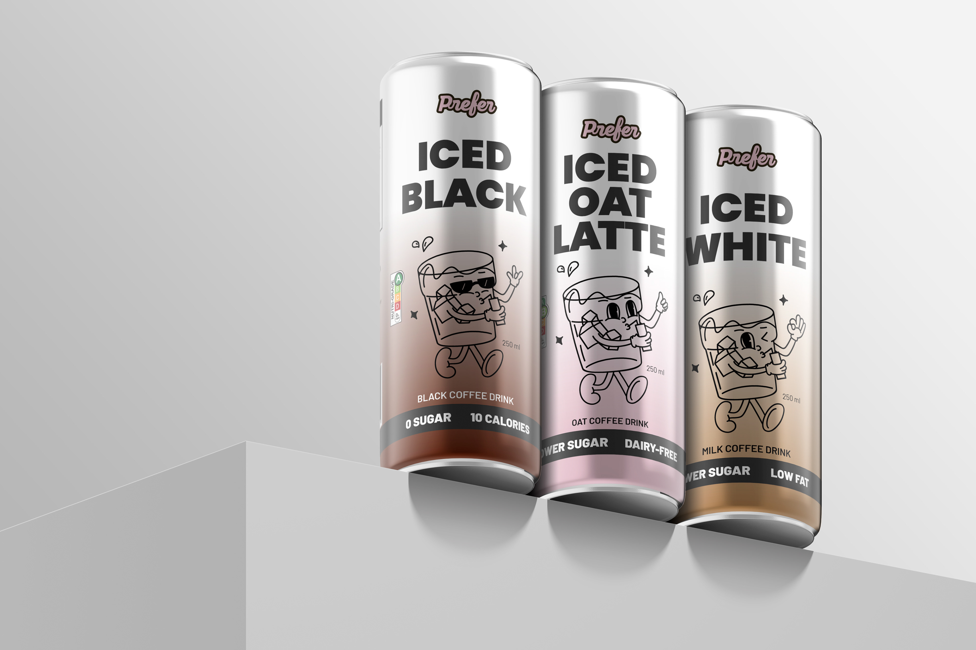
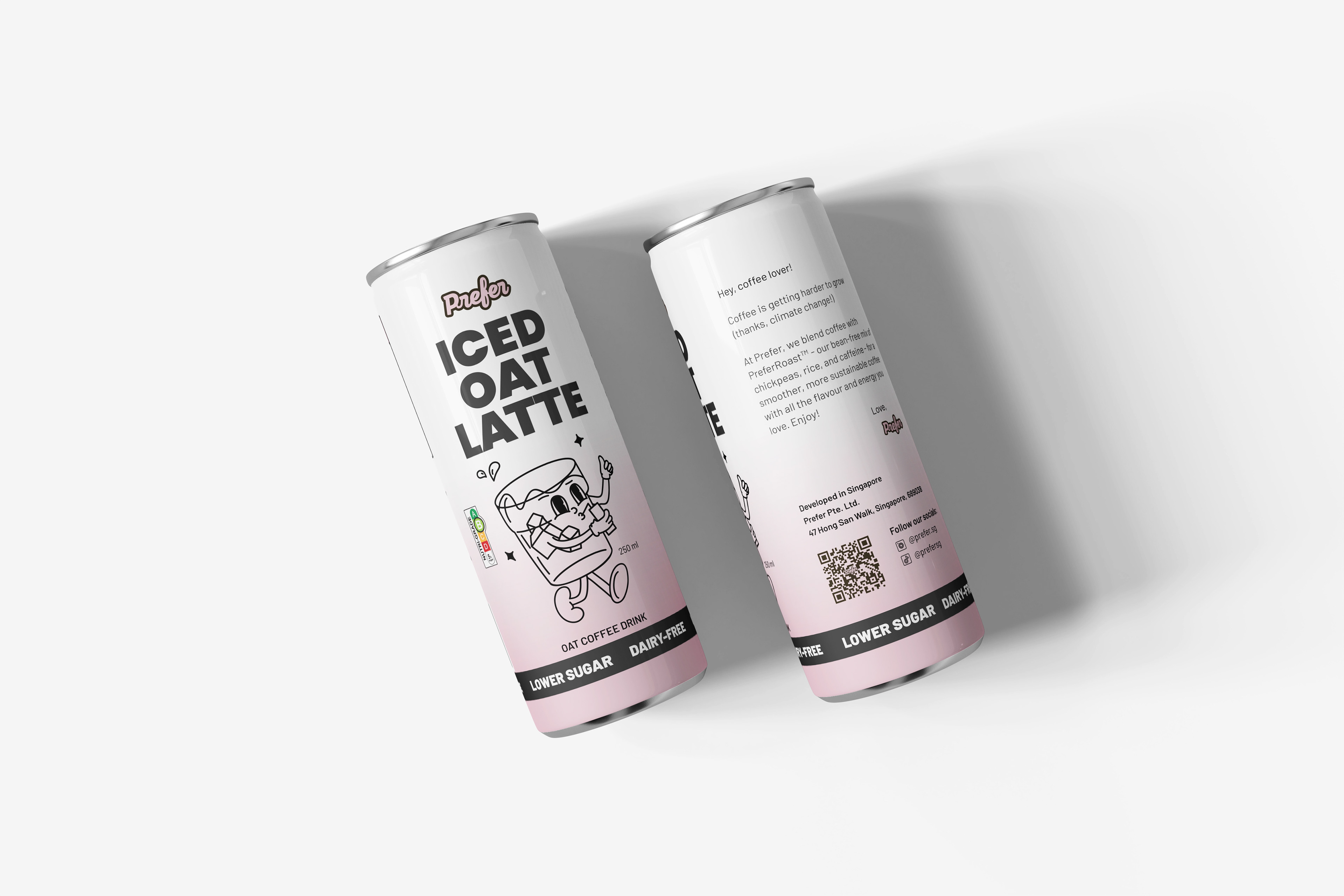
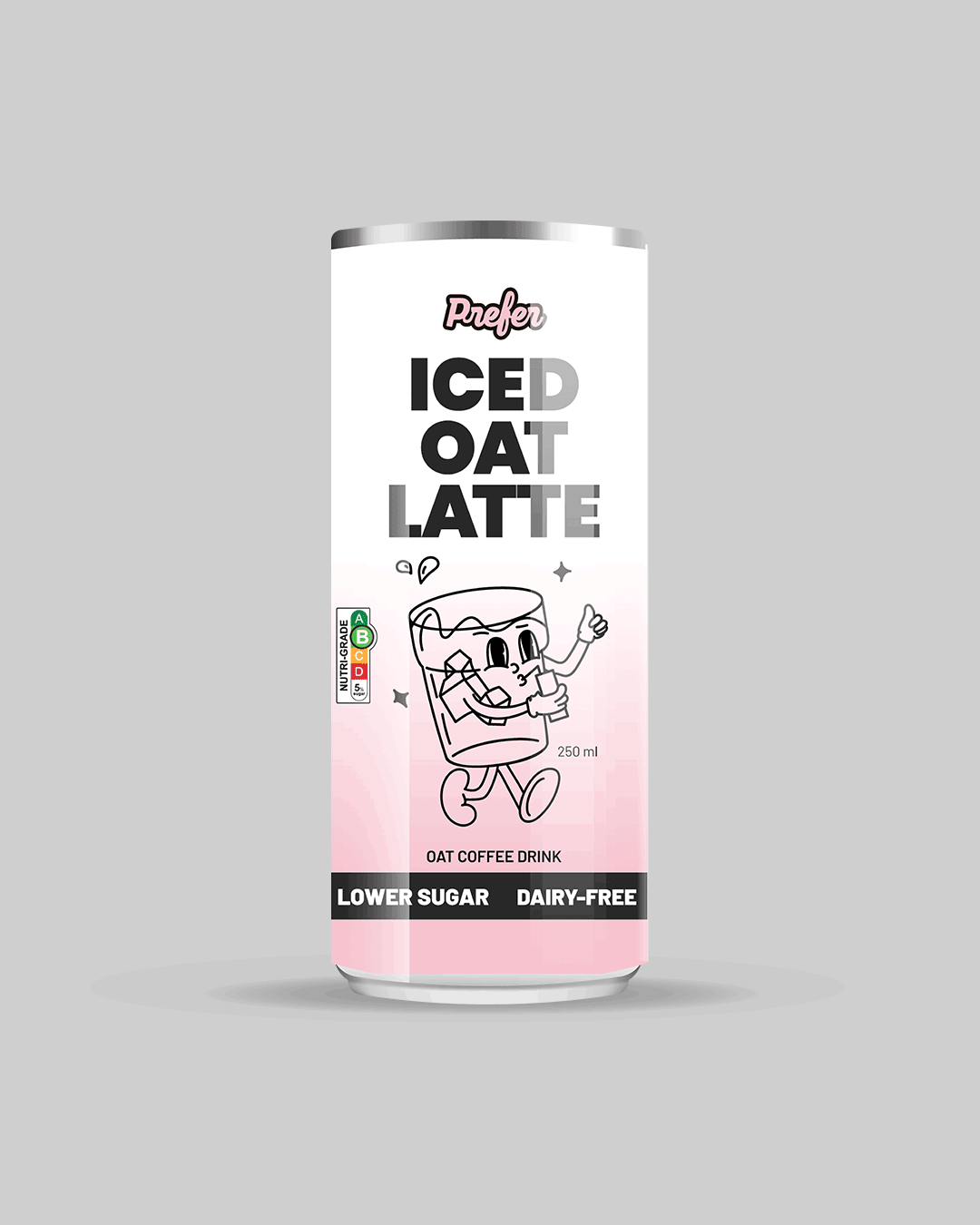
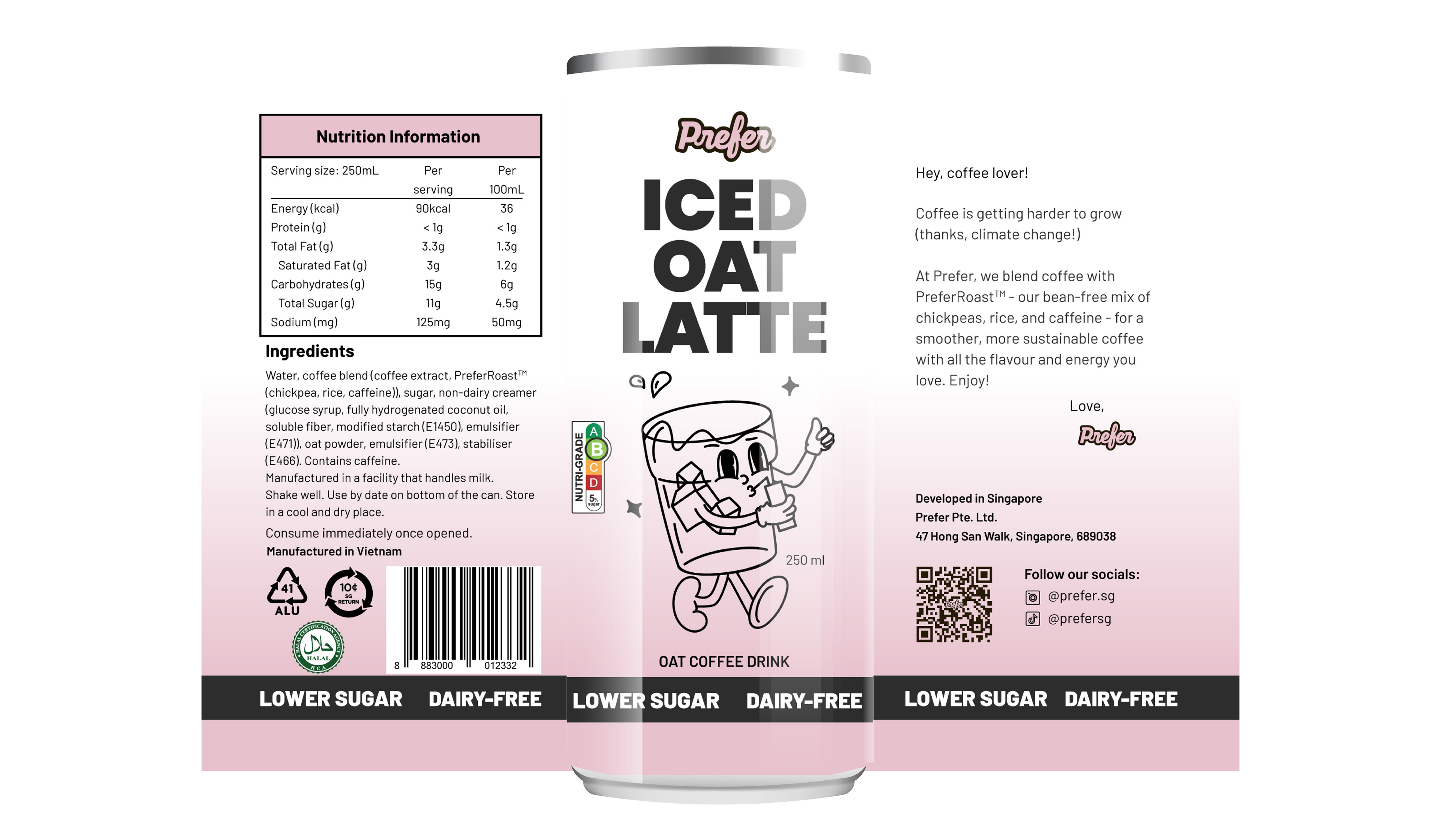
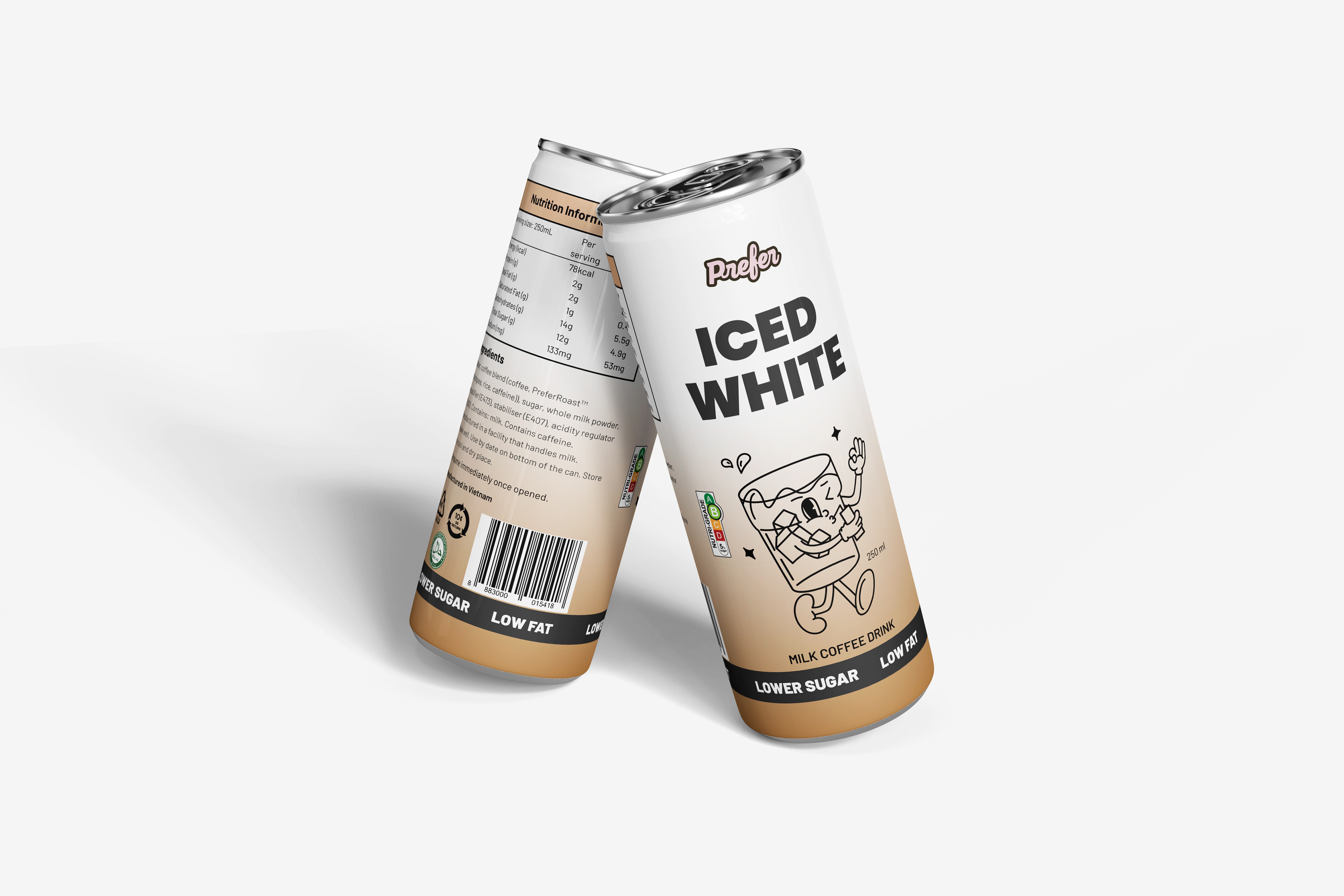
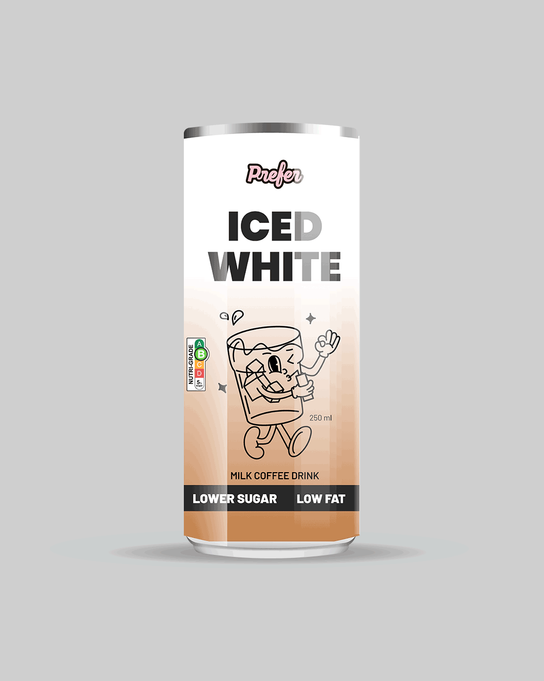
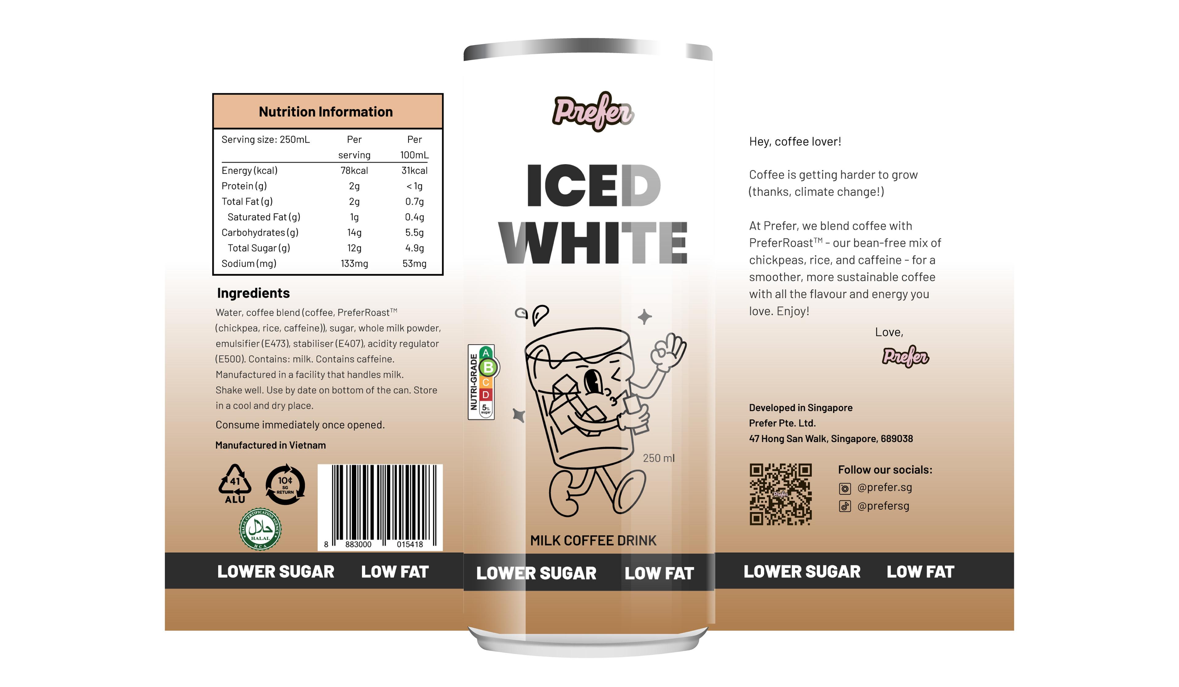
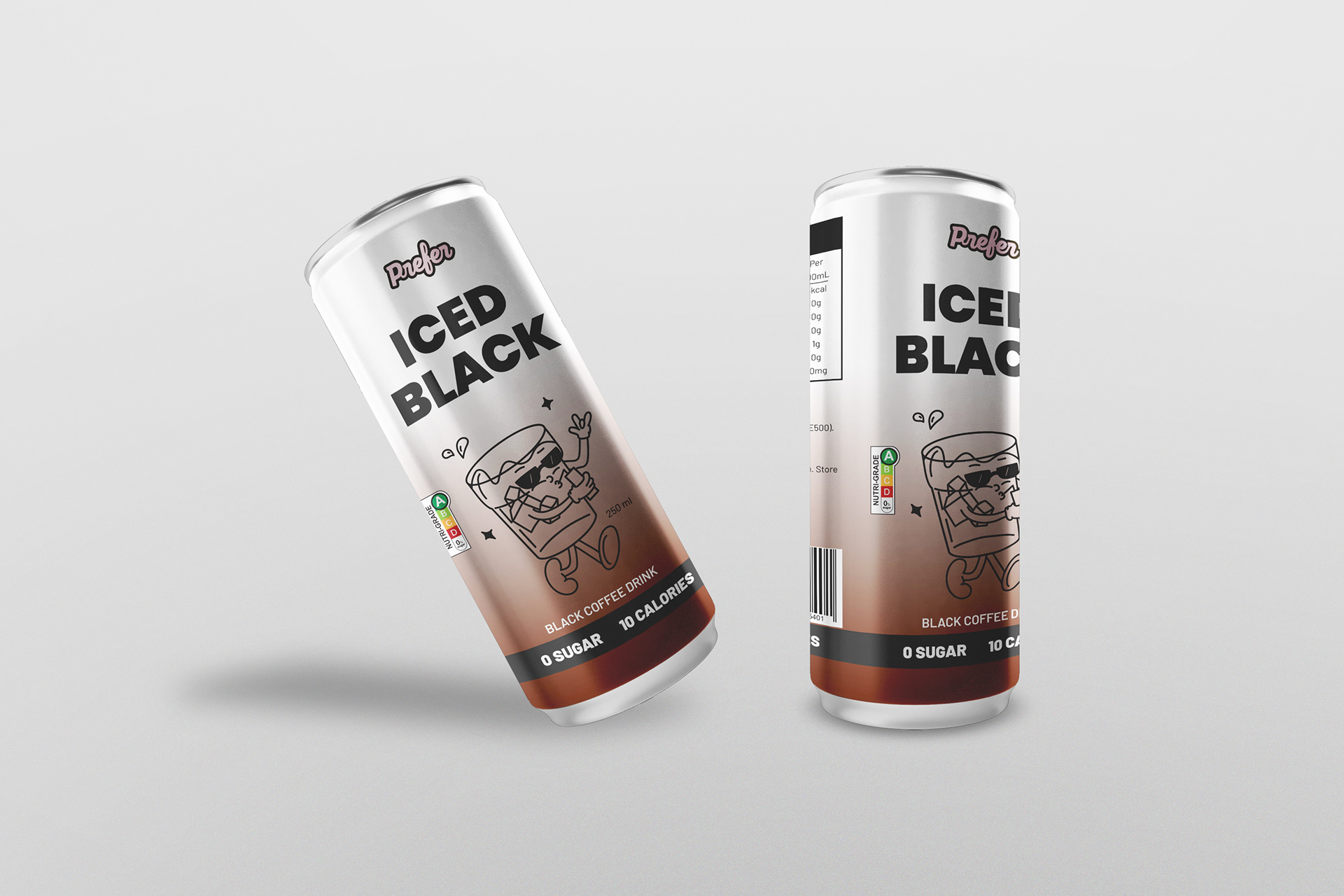
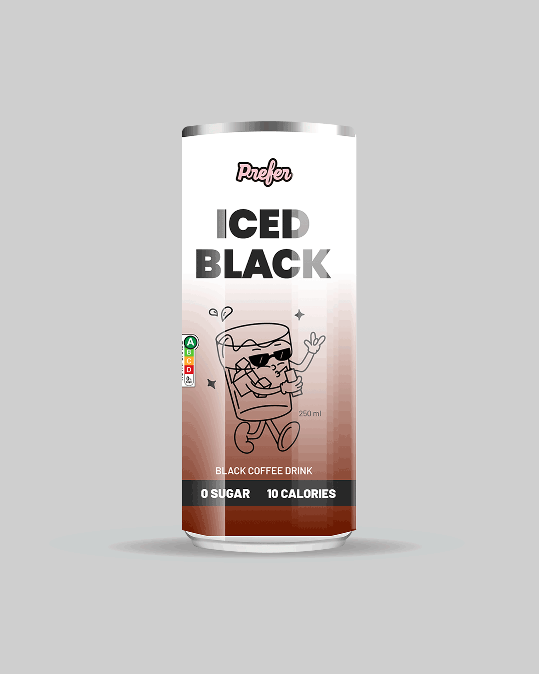
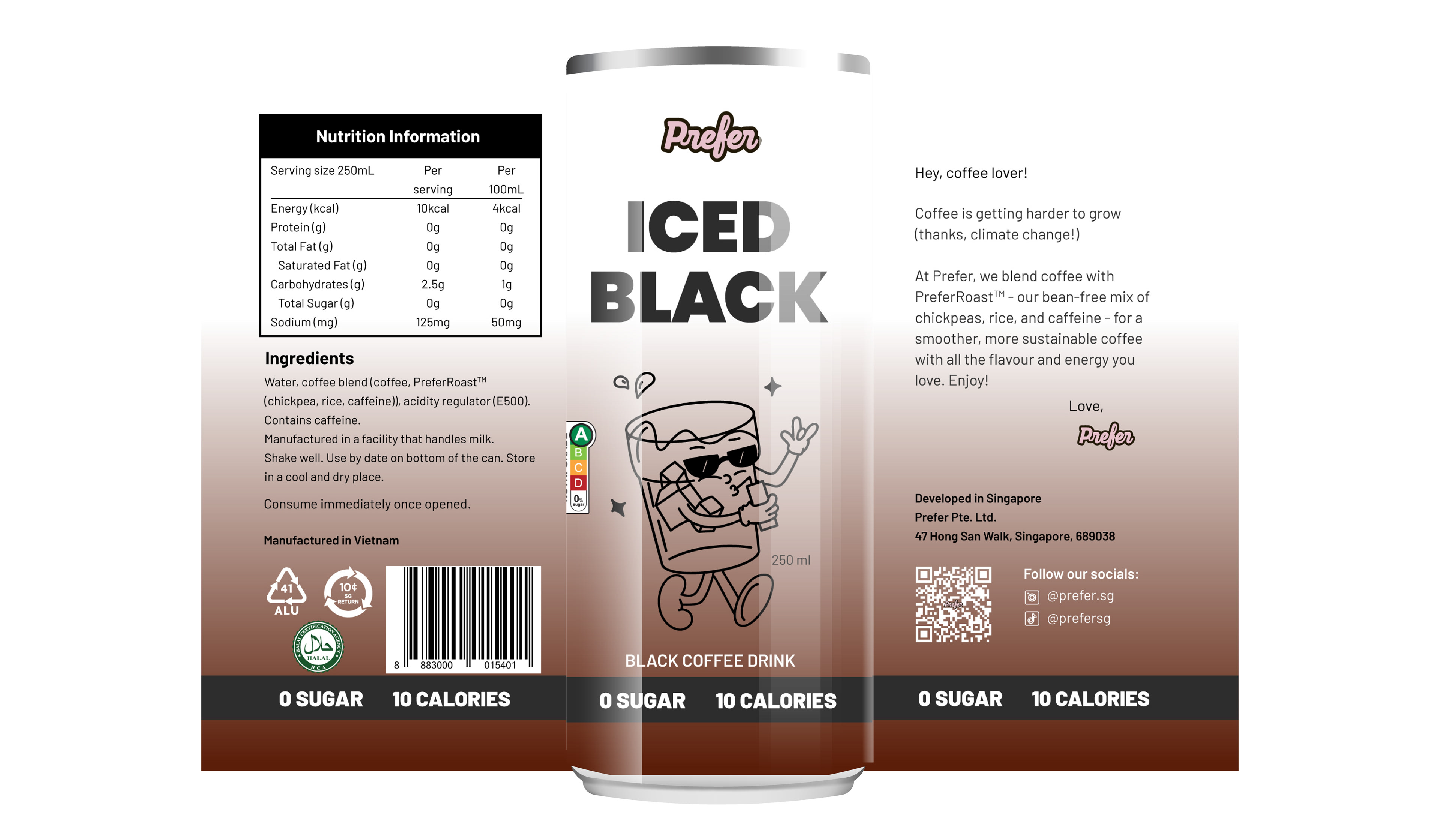
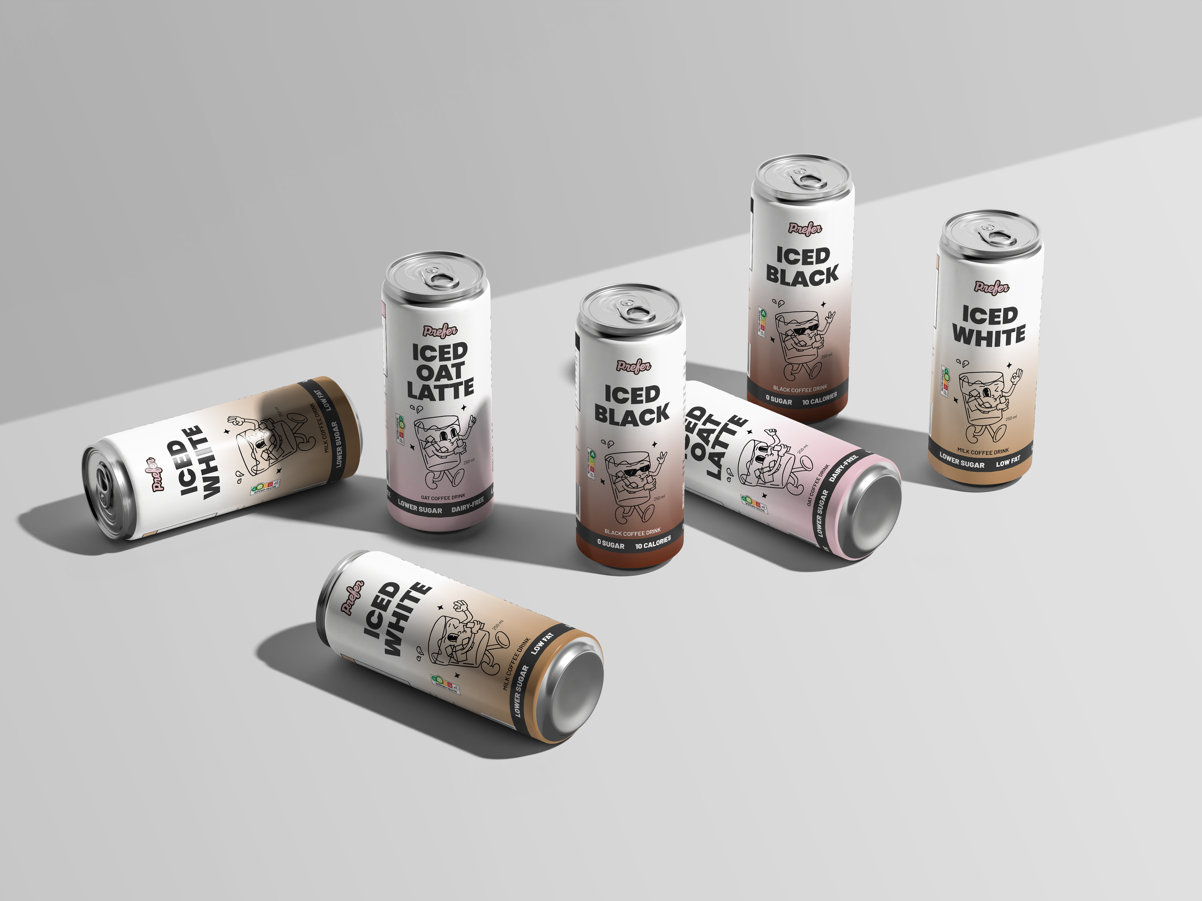
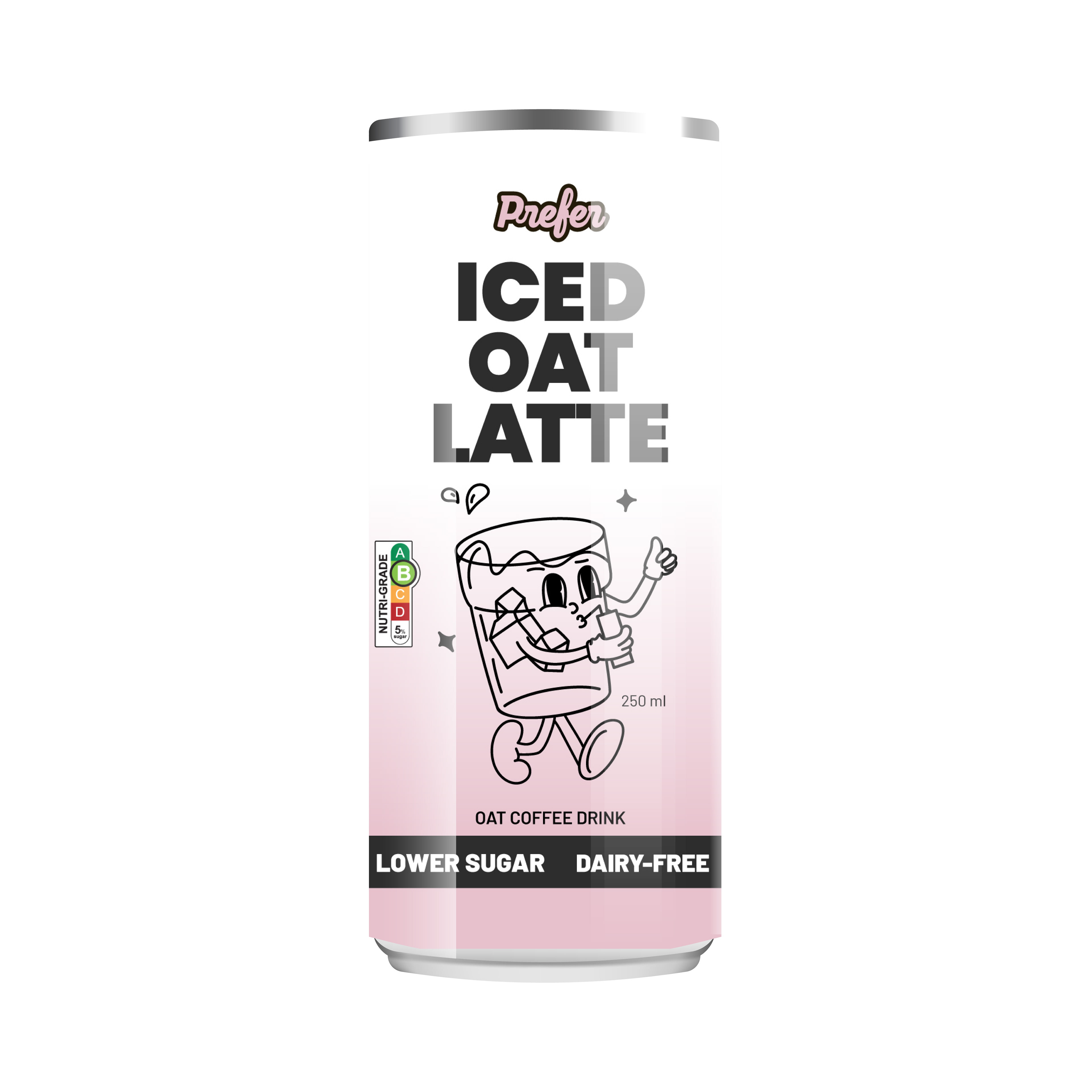
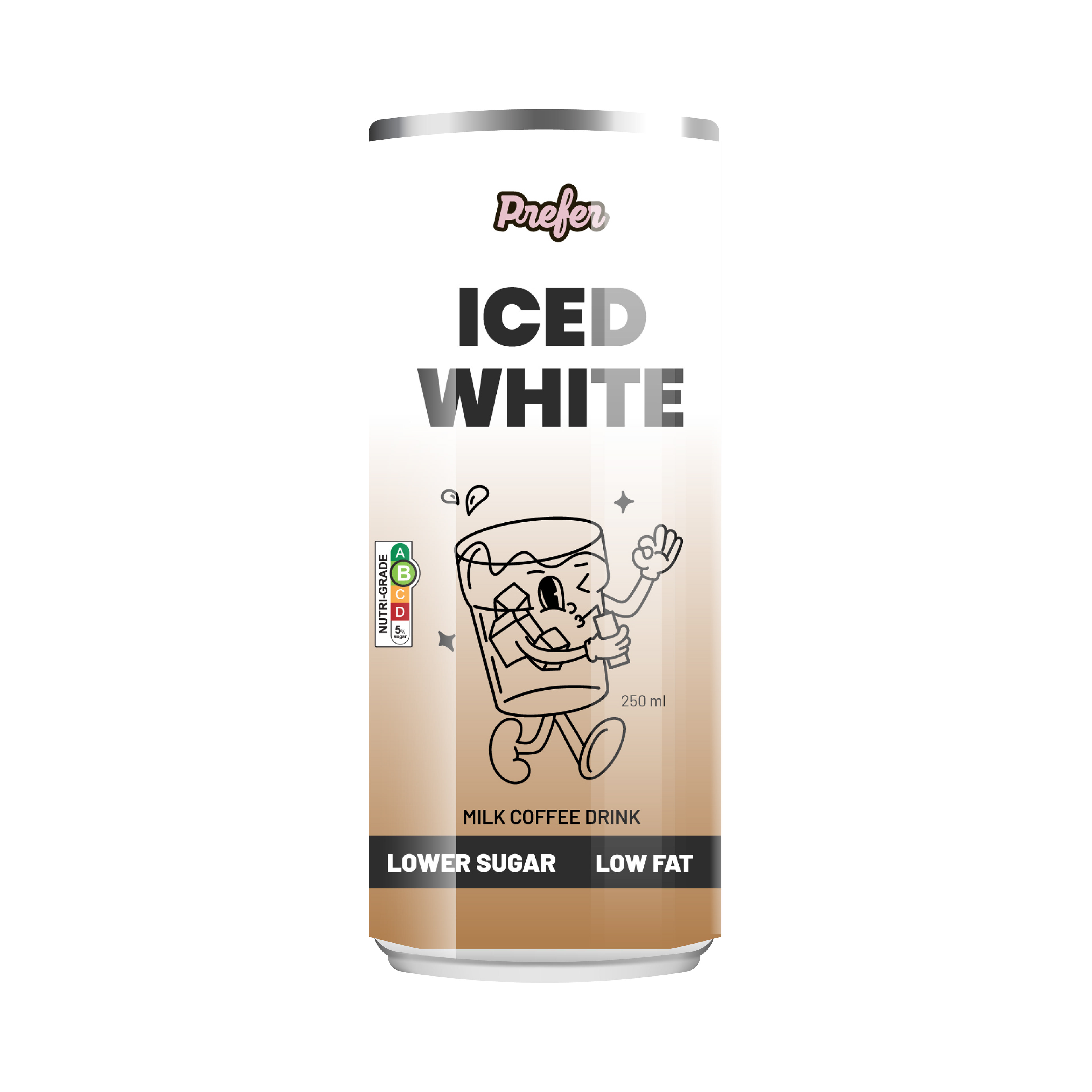
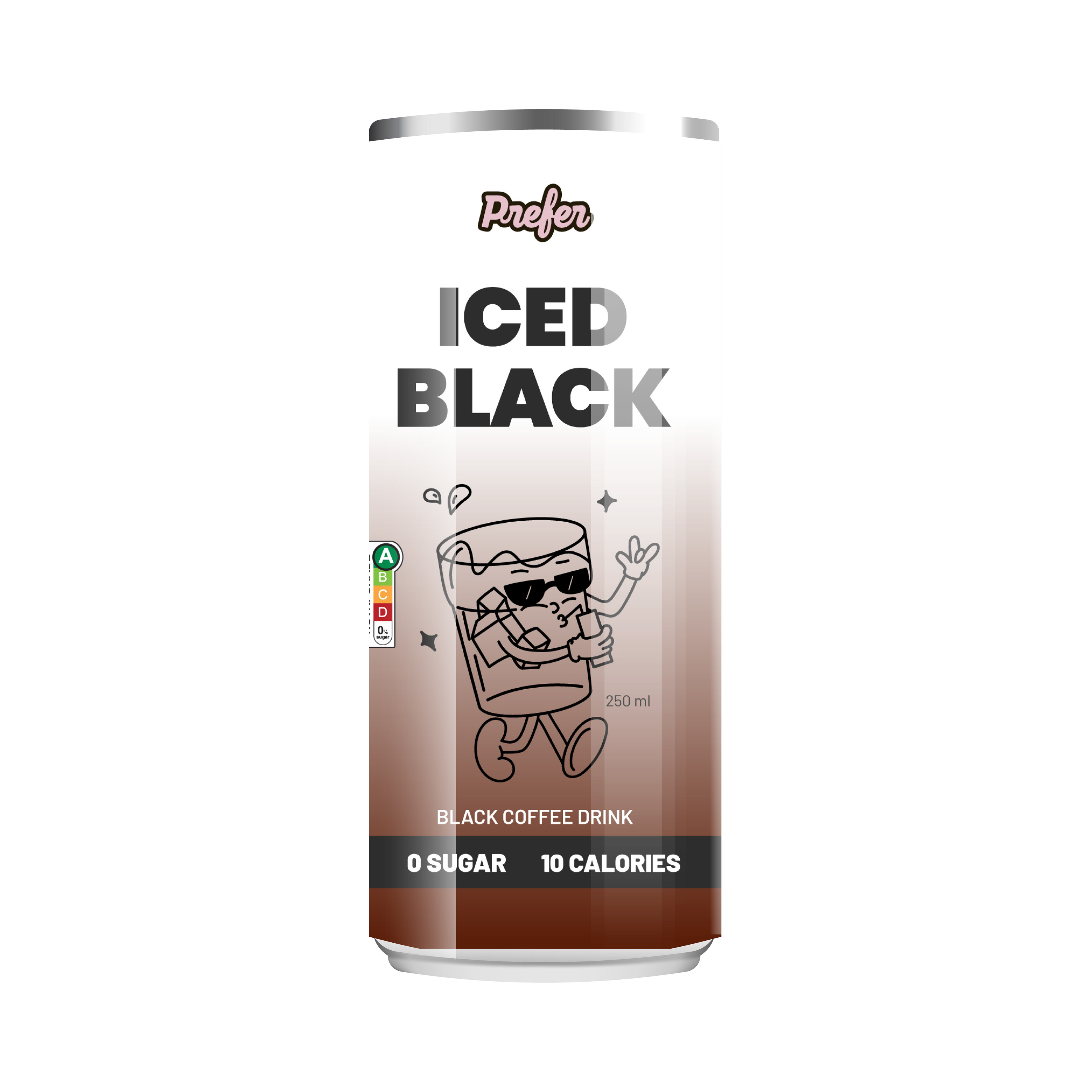
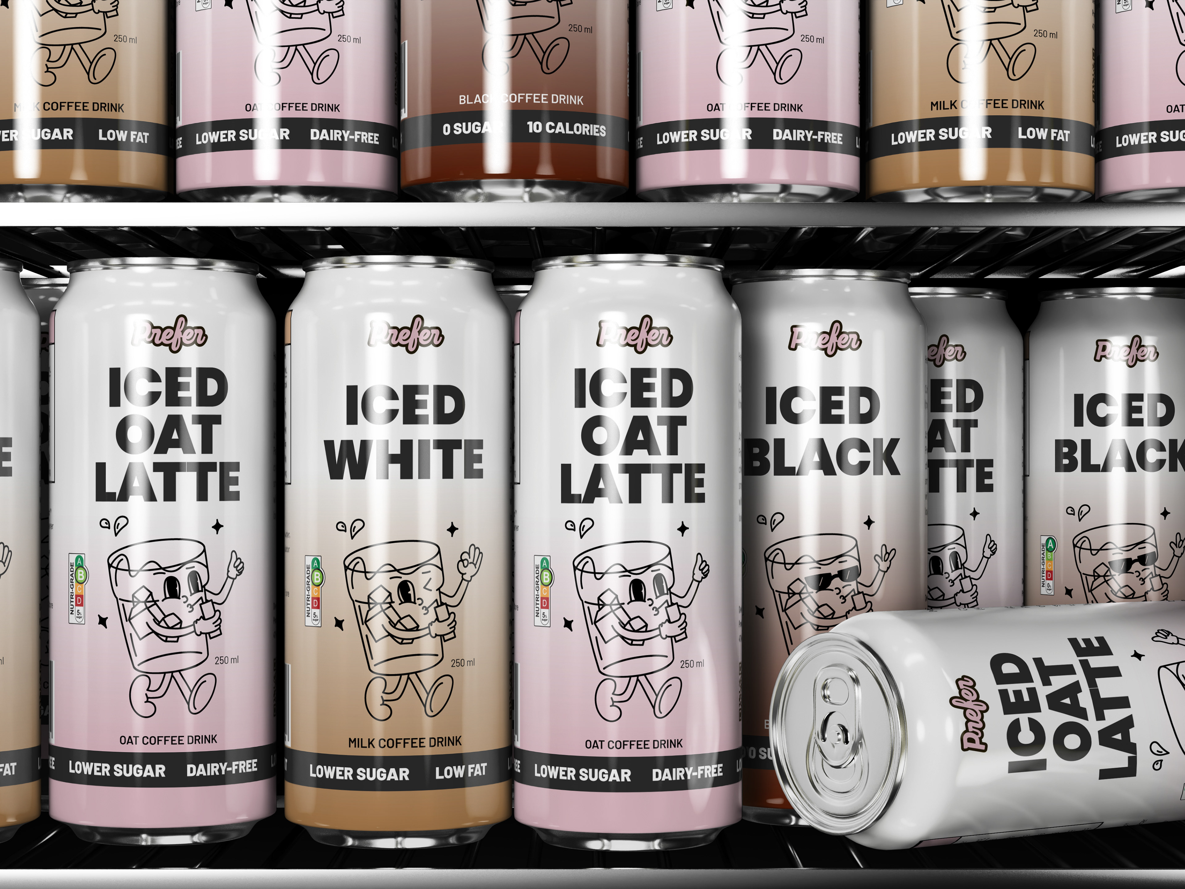
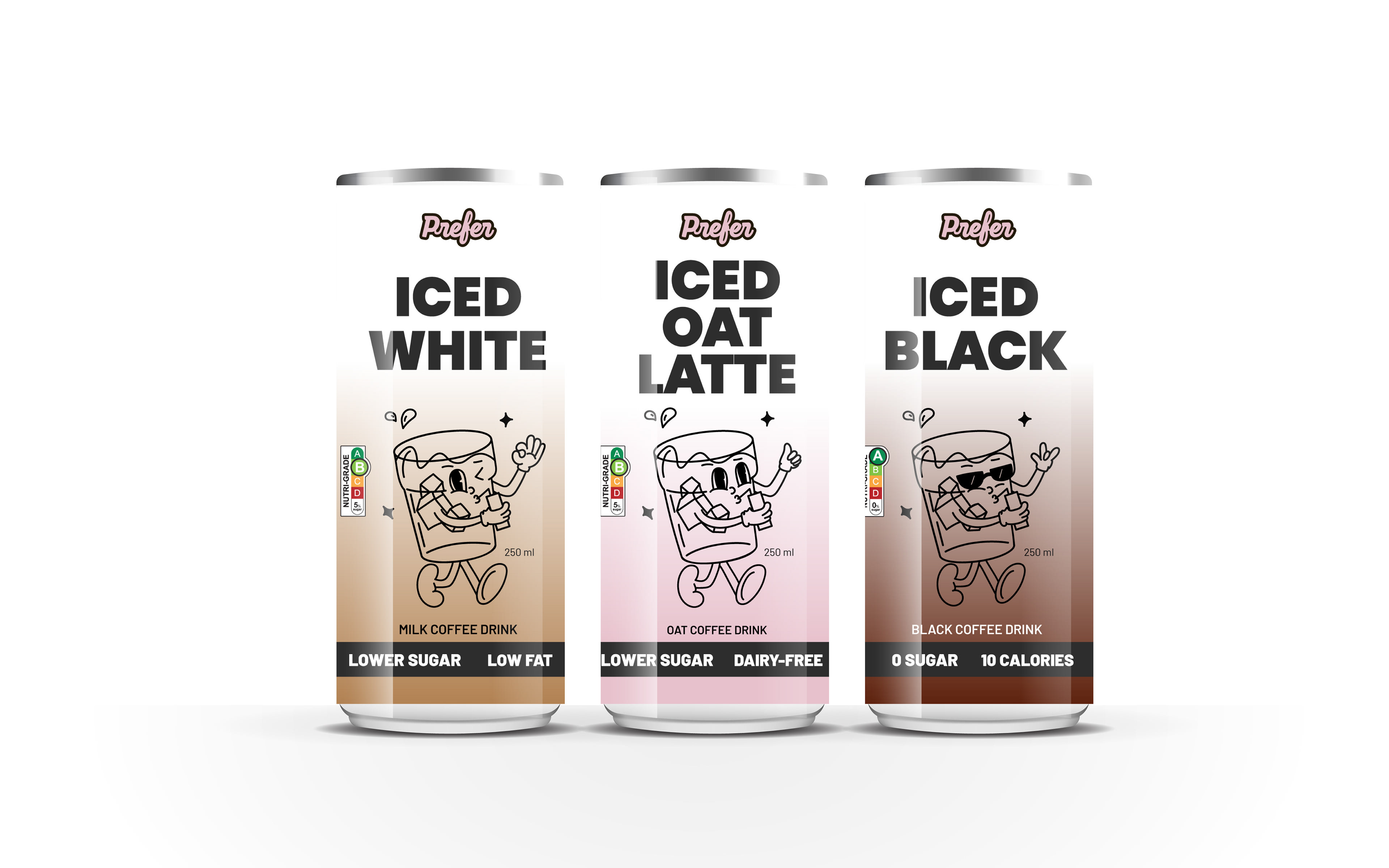
This project focuses on creating a cohesive packaging design system for Prefer’s innovative no-bean coffee line. The brief required developing a visual identity and packaging combo for three distinct SKUs, each showcasing a unique flavour profile while maintaining brand consistency.
The concept centers around a playful illustrated character — a joyful glass of coffee — interacting affectionately with the product. This character not only adds personality and approachability but also symbolizes Prefer’s mission: crafting a lovable, sustainable coffee alternative through their bean-free PreferRoast™ blend.
The final design balances clean minimalism with expressive charm, ensuring strong shelf presence and clear communication of product benefits. The result is a modern, friendly, and future-forward packaging system that reflects Prefer’s innovative spirit.